Division
Tumarbike Tolegen 193015:
Tumarbike is the coder of the website. She created all pages according to the prototypes and made sure everything is working fluently. Wrote parts of the content as well
Floor Verhoeven 192963:
Floor made the design for the website. She researched different layouts and designs for the website and implemented this while designing our own website.
Matheus Jantz Longhini 192424:
He helped design the site together with Floor and he supported Aleksandra with the content.
Olivier Brendel 191854:
Olivier was responsible for the testing of the paper prototype and drawing a conclusion from the results. He also created the content for the justification document
Aleksandra Angelova 190275:
Aleksandra wrote a large piece of the content of the website. She also did a large part for the marketing. Apart from writing a content she helped Tuma with pasting it in the code, creating color code, finding more content sometimes.
User tests
Conditions
For the testing of the Paper prototype we had 3 participants and for the website we had the same amount of participants. The paper prototype was a 2nd version because we decided to make some changes on the prototype so all the tests were performed on the newer version. Since it was COVID-19 we couldn't get many testinging participants outside our house so this explains the scarce number of participants. The participants are 2 roommates of Olivier and 1 friend of the roommates. Although they have no experience with coding we thought these are the perfect participants for testing because they just click on stuff they think they can click and this shows some interesting results.
Outcome Prototype
For the paper prototype everything went pretty smooth the buttons were easy to find and the overall layout was clean and easy to navigate through. The participants did think there should be pages for the vision mission and story because these were missing. although the story was on the about page.
Outcome Website
The website was pretty straight forward for the 2 participants. The only thing that they found odd was that the products tab only was accessible by scrolling down on the home page and clicking on products at the bottom of the page. They also had to note that they had to click the back arrow after visiting a page. It was impossible to click on another page when on a clicked page already.. They did like the colours and the layout of the different pages. They thought it was a very cohesive website.
Recommendations
The recommendations of the participants are:
When you click the logo on the top of the page it makes you go back to the home page.
Make the story button clickable because the extended version is on the website.
Make the quiz smaller.
Click here to see the paper prototype, adobe xd prototype
Click here to see the recordings of the tests
Fonts
The font we selected embodied the character spirit of our brand for parents. The playful color yellow is balanced by a modern and clean font that expressed maturity, it's a very easy font to read especially since the target group of the brand is 40-50-year-old parents. The Raleway family font is a ‘superfamily it comes along with a selection of different styles and weights that give us as the designers more creative freedom. We worked with contrast so when there is yellow the text on top of it is white and when there is just a blank piece of the page the font will be black or bold yellow. In the footer we used Lorem impsum since it is also very easy to read font with minimalistic vibe.
Color Codes
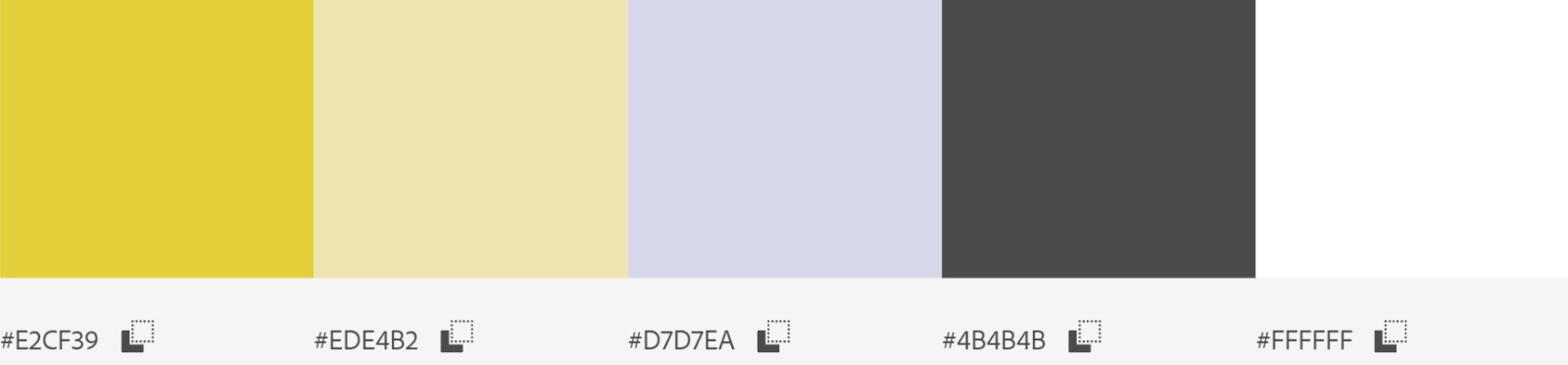
The colour palette of our website and brand identity is very subtle and user friendly, with the main colour being yellow. Yellow is also seen on our logo and we choose it because it is a colour that radiates happiness and good feeling. The logo also consists of black. The other colour that stands out is the light purple, fading from the yellow. It is used over the pictures and on the buttons. The other colours are just nuances that compliment the main ones.